Boots Strap
WHAT IS BOOTS STRAP?
- Bootstrap is a popular front-end framework for building responsive and mobile-first websites and web applications.
- It provides a collection of CSS and JavaScript components, templates, and tools that make it easier to design and develop modern and visually appealing user interfaces.
- Bootstrap is built with a mobile-first approach, which means it prioritizes designing websites and applications for mobile devices and then scales up for larger screens.
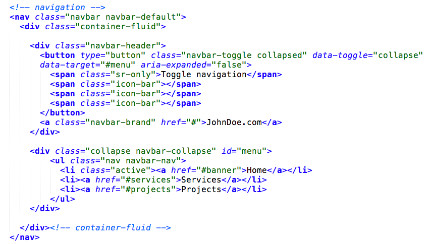
- Bootstrap offers a rich set of ready-to-use UI components, such as navigation bars, buttons, forms, carousels, modals, and more.

USE OF BOOTS STRAP
Bootstrap is widely used for creating responsive websites. It provides a responsive grid system and CSS classes that allow developers to create flexible layouts that adapt to different screen sizes. This ensures that the website looks good and functions properly on various devices, including desktops, tablets, and smartphones.
Bootstrap’s extensive library of pre-built components and styles makes it a valuable tool for rapid prototyping. Developers can quickly assemble and customize components like navigation bars, buttons, forms, and more to create functional prototypes of web pages or applications. This helps in visualizing the design and user interface early in the development process.
Bootstrap offers a set of predefined styles and themes that provide a consistent look and feel across different pages or sections of a website. This makes it easier to maintain a unified design and branding throughout the project. Developers can leverage Bootstrap’s design elements, such as typography, color schemes, and spacing, to ensure a visually cohesive user experience.
Bootstrap handles browser inconsistencies and ensures that websites built with it work smoothly across different web browsers. It includes CSS and JavaScript code that takes care of browser-specific quirks, saving developers the hassle of writing and maintaining browser-specific code. This helps in reducing compatibility issues and provides a consistent user experience across various browsers.
WHAT ARE THE FEATURES OF BOOTS STRAP?
Responsive Grid System – Bootstrap provides a responsive grid system based on a 12-column layout. This allows developers to create responsive and flexible layouts that automatically adjust to different screen sizes and devices.
Pre-built CSS Components – Bootstrap includes a wide range of pre-built CSS components such as navigation bars, buttons, forms, modals, carousels, and more. These components are styled and ready to use, saving developers time and effort in writing CSS from scratch.
Typography and Text Styling – Bootstrap offers a set of typography classes that make it easy to style text elements. It provides a variety of headings, paragraphs, lists, and inline text styles to create visually appealing and readable content.
THE BENEFITS OF LEARNING TO CODE WITH BOOTS STRAP
Rapid Development – Bootstrap provides a collection of pre-built components and styles, allowing developers to quickly create responsive and visually appealing websites or web applications. It saves time and effort by eliminating the need to write CSS and JavaScript code from scratch.
Consistency and Cross-Browser Compatibility – Bootstrap ensures consistency in design and layout across different browsers and devices. It takes care of handling browser inconsistencies and responsive behavior, making it easier to create websites that look and function well on various platforms.
Responsive and Mobile-First Design – Bootstrap’s responsive grid system and components enable developers to create mobile-first designs. With Bootstrap, websites automatically adapt to different screen sizes, ensuring a consistent user experience across devices. This is crucial in today’s mobile-centric world.
Customization and Theming – Bootstrap offers a high level of customization. Developers can modify default styles, override variables, or create custom themes to match specific design requirements. This flexibility allows for the creation of unique and branded designs while still leveraging Bootstrap’s core functionality.